Saturday, 17 July 2010

I Managed It! (posted by Lesley)


Well, you know what they say 'Better Late Than Never' and that certainly applies to this particular project. Way back in May it was my turn to choose our project for the month from the June issue of Craft Stamper. I chose Sharon Neill's pretty canvas thinking it would be a relatively easy project as my friends and I all had a very busy month ahead. I couldn't have been more wrong. Jo was the first to finish but not without some trials and then Judith managed to get her's done also with difficulty but Elaine and I really struggled. I had three aborted attempts which were truly only fit for the bin. The colours I chose looked a complete mess and I just couldn't get the tissue to 'disappear' once I pasted it to the canvas. I decided to give up and got on with one or two other projects I needed to get done together with my flag book for our June project (which went like a dream).


Then I decided to have another go at the canvas as I don't like to be completely beaten and lo and behold, I managed something presentable. It's no masterpiece but it's not too bad and I do like the colours and the masking. I also managed to get the tissue to almost disappear so I thought I'd post it before we announce Jo's choice of project from the July issue of Craft Stamper.


Everything I used for this project except the 6" x 6" canvas and the tissue paper came from Graphicus. I am sooooo pleased that I managed to finish this as I really thought it was a lost cause. Thanks for visiting.

Hugs
Lesley Xx

Wednesday, 14 July 2010

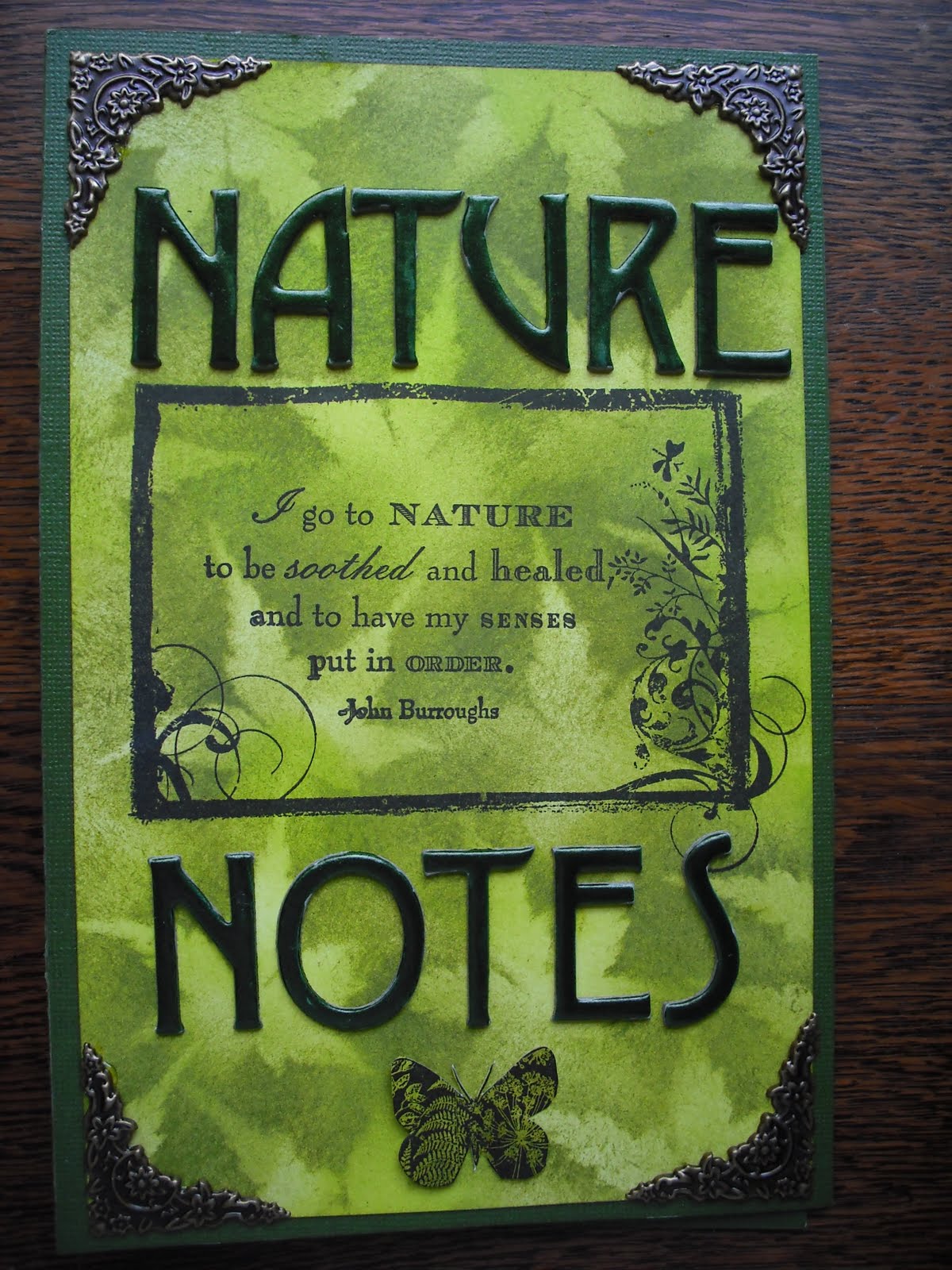
Nature Notes (posted by Elaine)

Well here I am, last, but not least hopefully with the last of our June quartet projects!! Well we have had a busy time lately, plus I had a disaster with my first set of flags that I recounted recently on my own blog here! I was delighted to choose the flag book project and I think we have all really enjoyed working on this one. The other girls have produced stunning and colourful projects.


Once again I chose a nature theme for my project book. An amazing number of stamps is needed for the flags unless you want to repeat pictures, so nature themed stamps was my safest bet as I have a sizeable collection! The basic design of my book is based around the idea of a notebook with handwritten notes and sketches of plants and insects observed in the field. I used Adirondack dye inks in Willow, Citrus and Lettuce to ink my flags and cover backgrounds. The twist to the way I did this was to use my leafy background technique. Before much longer I am planning to post a tutorial of how I do this on my own blog as a few people have asked me how it's done. Basically, the Willow and Citrus are applied as the background with Cut 'n Dry foam, and the Lettuce is put on stippled using a cheap shaving brush, using a real maple leaf as a mask. The leaf effect shows most clearly on the covers.


I mounted my covers and flags on a Forest Green Core'dinations background. My cover is decorated with a Prima Frame, an Inkadinkado words stamp I recently found in the bargain bin at the Newbury Art Stamps Show and a Crafty Individuals butterfly. The letters are Basic Grey Wassail, painted with olive green Viva precious metal paint and I have added decorative metal corners.

Here are quite a lot of pictures of the inside to show the different stamps I used to stamp on the flags. All the script is stamped in Olive Green Ranger archival ink using the very useful Prima Notary stamp, the other images are stamped in Jet Black Ranger archival ink.

The first set of flags use Darkroom Door stamps, I think they are called Friendship Flowers, plus Crafty Individuals butterflies and a bee, I think this is a Beeswax stamp. As in Willy's instructions I used bleach to highlight certain parts of the design. This is the first time I had tried this technique and I was really pleased with how easy it was, provided you are really careful not to overdo it!!


My second view has stamps from Elusive Images, Wild Meadow, Eastern Grasses and Iris plates, as well as Lavinia, Beeswax, Crafty Individuals stamps and a set of ferns I bought second hand that are from an unidentified company.


The next set uses more Elusive Images stamps from the Wild Meadow and Spring plates, Lavinia stamps. Armerio and Crafty Individuals.


The final set uses more Elusive Images stamps, and others from Lavinia and Crafty Individuals.


The back cover uses an Inkadinakdo stamp from the Utopiary set, another bargain Inkadinkado stamp bought at the Newbury show and a Paper Artsy flourish circle. I have added punched leaves in black card using the McGill pine bough punch.


This picture shows the flags as they alternate in the way the book opens. I managed to get myself muddled about how they would all work as I was stamping, so had to stick them on back to front to the instructions, but it worked thankfully!!


So that's my project for this time.

Last but not least, some of you may have noticed I didn't post last month's canvas project. I just wanted to show you that I did try - a number of times, but I am not at all happy with any of my results, so I am admitting defeat, giving in gracefully, letting the side down and moving on, so we can announce our next project! 


Thanks for popping by!

Elaine  


Friday, 9 July 2010

Wandering through a Rainbow Garden (written by Judith)

Well, I've finally finished my flag book, I can't believe that it's taken me so long! June was such a busy month, and the time just flew by.
I have chosen to incorporate some elements used by Willy in her lovely book shown in Craft Stamper magazine, like the bleaching, for example. However, I decided to make my flag book more three dimensional. Although I have chosen different stamps, and a different colour scheme to Jo and Lesley, I wanted to add more elements. Therefore, I have introduced decoupage, layering, and chipboard shapes to some of my tags. I have used butterflies and flowers throughout the book, which could have become repetitive, so I needed to vary what I did to my tags.
Those of you who saw the sneaky peeks on my blog last night could be forgiven for thinking that I have gone with red, yellow and orange as my colour palette, but I decided to use a few more than that. I have also used green, blue and purple too! I have graduated my colours, rainbow fashion down my book, to again add variation to the whole thing. I used the gorgeous Patchwork butterfly from Elusive Images on the front cover with a layered flower, also from Elusive Images. I have given the butterfly some antennae which Jo might recognise as a present she gave me at our mini Retreat. I have used cream Prima leaves, brushed with DIs.

For the back cover, I have again used my Elusive images stamps, and made a poppy head from a cream flower, by folding it up, and again colouring it with DIs, and glueing it in place. Throughout the book, I have used sequin waste, or a sequin waste effect stamp as a background.
I chose to use black card like Willy, Jo and Lesley, as it really is the best colour to display the lovely colours that I have used, and brings the Stazon out. I really enjoyed bleaching some of the images, but even in a well-ventilated room, it gave me a headache.


Here you can see the inside of my flag book, and the graduation of the colours that I used. The first layer at the top was Mustard seed, Wild Honey, and Barn Door. The second layer are Mustard Seed, Shabby Shutters, and Broken China. The third layer are Shabby Shutters, Broken China, and Dusty Concord.
I kept a common element from one layer into the next, and so on.


I have lots of photos to show you, and apologise if you feel overloaded by them, but would like to show you one or two tags close up.


I have really enjoyed making this project, as the images are some of my absolute favourites. I love making flowers, and working with these colours has been cheering and uplifting. I hope they brighten your day too! Thank you for looking, and any comments will be really appreciated, Judith xx

Thursday, 1 July 2010

Paris in the Spring (posted by Lesley)


Hi Everyone,

Well, I'm very relieved to say that I managed to complete June's project - unlike the one I chose myself (lol!) for May. Let's just say that is still a 'work in progress'. I have thoroughly enjoyed making my flag book so thanks a lot Elaine for choosing it. I hope you won't be bored as I also used the beautiful Paris stamps from Elusive Images as Jo did. I mixed mine with another Paris set and for the life of me, I can't remember whose they are. I'm hoping Jo's wonderful memory serves me well (as she was with me when I bought them) and that she'll be able to add the name ................... here! I also chose the Paris stamps because I needed so many on the same theme to be able to stamp 18 flag sides and I suppose it was inevitable that at some point two of us were going to choose the same stamps for a project.

I hope you don't mind a lot of photos because this project warrants them I think.

The front cover


I thorough enjoyed the painting with bleach technique for putting in the hightlights


I did almost mess up by not working out in advance which images I wanted to be on the 'top' side of the flag once they were attached to the spine


I also had an accident with one of my Distress Inks. I decided my inkpad needed re-inking but although I was using Old Paper I was thinking Tea Dye and I re-inked with the wrong colour. I now have an interesting new Distress Ink colour, lol, and had to use a different DI for my trio of colours which were Wild Honey, Crushed Olive and Tea Dye.

I also had one major moment of panic. Because the second set of stamps I used were clear stamps I didn't want to use Stazon for stamping the images so I decided to go with Ranger Archival Black. Then when I came to paint them with bleach I suddenly thought Uh! Oh! is the bleach going to remove the black image? I had also taken note of Willy's advice that some of the DI colours react differently to the bleach so I stamped an image and put some patches of the three colours onto some scrap card and 'painted' them to check them out before I risked ruining my carefully stamped flags. Yipee, all three colours disappeared beautifully and the Archival Black stayed put!


The back cover


Finally, another look at the front cover so that you can see the details a little better.


I'd like to say a big thankyou to Willy for her inspirational article in June's Craft Stamper magazine. It's been a brilliant project to do and I will definitely be using the painting with bleach technique again.

Hope you enjoyed your visit and many thanks for any comments you have time to leave.

Hugs
Lesley Xx

Tuesday, 29 June 2010

Postcards from Paris (by Jo)

I was so pleased when Elaine chose Willy's book for our next project. I thought the combination of the black card and the bright inks was stunning. I chose a black background for my book and wanted to use bold colours too but wanted to avoid copying Willy's colours. With hindsight I would maybe not have chosen Distress Inks and maybe gone for sizzling colours instead but these were the inks that were in my head at the time and they do seem to suit the subject matter. I chose Broken China, Pine Needles and Dusty Concord.


It was only after I inked all the tags that I realised just how many surfaces I'd be stamping on. I'd chosen Elusive Images' Paris Memories plate as I thought it was my best chance of having a large number of stamps on one theme at my disposal. Even so, I found I had to introduce other stamps so I didn't have to repeat too many.
I used some stitch stamps from HOTP and also some sequin waste for backgrounds. Other images came from Paperartsy, Prima, The Artstic Stamper, Butterfly Kisses, Craft Stamper and Dimension Fourth.

I really liked the bleaching on Willy's flags too and used some bleaching on every tag. The flower worked particularly well so I did use that as a recurring motif, with Hero Arts Old French Script stamped over it. I discovered what Willy meant about the effects of the bleach over different colours.


Putting the book together proved quite simple considering the great effect the flags produce. It was hard to get a photo of the book showing how the tags move but I hope these give you the flavour of how the pages look.


Finally, I decided to depart from Willy's project when doing the cover. I'd been very taken with the cover of Penny Bearcroft's Fuerteventura journal and wanted to produce a collage style cover along similar lines. I also wanted to have a crack at that style as I'm planning to produce my own holiday journal in just a few weeks' time. For my cover I printed some words over a panel from Artylicious' Decadent Brocade CD. This was mounted over some Cuttlebug embossed card, with some die cuts from the same Cuttlebug set (including the tag which was a piece of paper I'd been using to try out some Cosmic Shimmer and Crafty Notions mica sprays). The lamp image was actually my first bleaching practice piece. The key is a ScrapFX laser cut chippie, which had a thin coat of Viva Terra to give it a bit of texture then was lightly swiped with gold ink. The number tag is made with a stamp I love but don't often have the opportunity to use. It is from a US manufacturer. Probably Purple Onion. These bits are held together with an Idea-ology ball chain.


So this is the finished cover. It doesn't look very square as it is standing up. So, to use Judith's expression, it's decidedly 'on the wonk'. Thanks for nominating this challenge, Elaine. I really enjoyed it.


PS My apologies for the arrangement of pics on this post. I look forward to the day when what you see in the preview pane in Blogger is what you see on the page after you've published!

PPS I have just found out about Blogger's new post editor. It might be too late for this post but hopefully my next one will look much more sensible!

Monday, 21 June 2010

Project for June (written by Judith)

Well, slightly later than normal,we'd like to let you know what our chosen project is to be from the June edition of Craft Stamper magazine. Elaine has chosen the project this time, and it is 'Flutterby Flag Book' on page 16 by Willy Anderson. The lovely vibrant colours against the black are really striking, and the butterfly theme running through the book pulls a large amount of different stamps together.
Willy has suggested the option of a yearbook, or using tags for the flags, so it will be interesting to see what we all come up with. Jo has made a start and you can see her sneaky peek here

As you know, at the beginning of the month, we went on our mini Retreat near Bedford. We had four days of chatting, cooking, and crafting together. We had two adjoining appartments,which were stuffed to the brim with our crafty stash. We spent one day attending a class with Linda Elbourne at LB Crafts, making a hanging consisting of three mini canvases. We worked on our circle journals, making pages for each other, and trying our hand at skills that we taught each other. Elaine taught us how to make leafy backgrounds, using leaves from her garden and Adirondack inks. I taught the girls how to add beading to Stampbord, and they made a necklace. We didn't achieve everything that we had planned, but there is always next time! 


The farm where we stayed was brilliant, we made friends with the resident dogs, and admired the horses. The owner even brought her chickens round to meet us! She had a very large great Dane called Dufus, who was a little disconcerting, but if you were brave, and fronted him out, he was okay. 


As well as the four of us meeting up, we took our Art dolls, and photographed them together too. It was lovely to see each other's work in the flesh,because we only get to see photographs too.
We have lots of happy memories of our time together, and were very sad when we came to say goodbye to each other. Hopefully it won't be too long before we can meet up again.

Thursday, 27 May 2010

Alluring Alliums (written by Judith)

Well, it's with severe misgivings that I'm posting my project this month. This project was supposed to be our easy option, yet we have all struggled with this one. I have worked with canvas and gel before, and was not at all apprehensive as I started this project. However, I have not been able to produce the results that I wanted at all. This has been partly due to time constraints, and partly to the quality of my tissue paper I think.


I knew straight away that I was going to make my own mask for this project. I love alliums, and wanted to make a mask to represent that flower on a Monet inspired background. I thought about how I could achieve the effect that I wanted, and decided to make my mask in two parts, one for the stalk and one for an outline of the ball type heads.
I created a background, using Adirondack paint dabbers, using Pebble in the centre, and a mixture of Willow, Juniper and Cool Peri around the edge, blending them softly. I then placed my two masks together in the centre, and inked around them using Citrus for the stalk and Wild Plum and Currant for the heads. I then took the head part away, and inked around the little branch pieces using first Citrus and then Stream for shading.

Next I used small dots of colour around the edge of the heads to represent the flowers of the Alliums. I used a mixture of Wild Plum, Citrus, Raspberry and White paint Dabbers.                                                          
For my stamping, I have used a combination of stamps from Elusive Images, Stampotique, Artemio, and Tim Holtz, using Stazon to stamp them on tissue paper and acetate to create the effects that I wanted. 
I decided  to cover my entire canvas with Golden Gel, which, as I anticipated, did cause my Adirondack Inks to brighten and move somewhat. This meant that I had to go over them again to repair the effect a bit. I would therefore reconsider using Adirondacks another time, or just avoid going over the whole piece with the Gel. You learn from these things. However, I did see it through to the end, and I enjoyed the process in a strange kind of way, so thank you Lesley, for challenging me! Judith x