Well, I obviously made that much too easy didn't I, lol! Thanks to Sue, Aquarius and Veronica for having guessed correctly. Sue, of course was the first to guess within minutes of my posting really but I didn't get chance to publish the comment until this evening. So can you email me your snail mail addy please Sue. I'm sure I have it somewhere but for the life of me can't find it and this is Sue's blog, http://suzib1b.blogspot.com/ which is well worth a visit. She has some lovely artwork on there and I visit often.
Thanks for having a guess ladies and look out towards the end of the week as Jo finished her project first so just needs a bit of time to be able to do the post and I will follow soon after with mine which I finished on Saturday.
Well I hope you haven't melted today. I don't think I've ever drunk so much water (which I hate) to stave of dehydration. 'Normal' temperatures on the way for Wednesday though thank goodness, lol!
See you in about a week's time all.
Hugs
Lesley Xx
Monday, 27 June 2011

A Little Poser For You ...............and a friendly competition. (posted by Lesley)
Happy Monday Morning Everyone,
I sincerely hope the temperature is not too much for you this morning. I have had the fans going from first thing this morning and to be honest, I could have done with keeping one on all night. Phew, it's blooming hot around here and I'm not a happy bunny in the heat, lol!
Anyway, enough of my English obsession with our weather, as the title says I have a little poser for you. If you remember when Judith announced our project for this month she had chosen a colour combo for us from the talented Rachel Jackson's article on page 76 of the May issue of Craft Stamper. Judith gave us licence to choose our own project to use this combo on so I decided to work backwards through my CS mags until I found one I thought would fit the bill.
Now, when I was looking through my many stamp sets trying to decide which I was going to use on my project I realised that I had doubled up on a little set of Paper Artsy stamps so I decided to have a little friendly competition. I want to stress that you do not have to be or become a follower of our blog to enter. All you have to do is have a guess at which project I have chosen from looking at the pic below and leave your answer in a comment. The first person to guess correctly will win the set of stamps (and I might find a few other bits and pieces to put in the envelope too). As a clue so that you don't go trawling through tons of past issues I will tell you that the project is in a Craft Stamper issue from either February, March or April this year.
This is the useful little set of stamps.

and this is a peek at some of the stash I used to make my project.
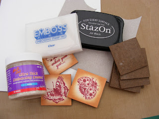
Even my buddies don't know which project I've chosen but they're not eligible, lol! I hope someone guesses correctly.
Have a good Monday everyone and as always thanks for your lovely comments.
Hugs
Lesley Xx
I sincerely hope the temperature is not too much for you this morning. I have had the fans going from first thing this morning and to be honest, I could have done with keeping one on all night. Phew, it's blooming hot around here and I'm not a happy bunny in the heat, lol!
Anyway, enough of my English obsession with our weather, as the title says I have a little poser for you. If you remember when Judith announced our project for this month she had chosen a colour combo for us from the talented Rachel Jackson's article on page 76 of the May issue of Craft Stamper. Judith gave us licence to choose our own project to use this combo on so I decided to work backwards through my CS mags until I found one I thought would fit the bill.
Now, when I was looking through my many stamp sets trying to decide which I was going to use on my project I realised that I had doubled up on a little set of Paper Artsy stamps so I decided to have a little friendly competition. I want to stress that you do not have to be or become a follower of our blog to enter. All you have to do is have a guess at which project I have chosen from looking at the pic below and leave your answer in a comment. The first person to guess correctly will win the set of stamps (and I might find a few other bits and pieces to put in the envelope too). As a clue so that you don't go trawling through tons of past issues I will tell you that the project is in a Craft Stamper issue from either February, March or April this year.
This is the useful little set of stamps.

and this is a peek at some of the stash I used to make my project.

Even my buddies don't know which project I've chosen but they're not eligible, lol! I hope someone guesses correctly.
Have a good Monday everyone and as always thanks for your lovely comments.
Hugs
Lesley Xx
Friday, 3 June 2011
Have Book Will Travel (posted by Judith)
Oh dear, the time just flies, I'm last to post as per usual, I'm afraid. I have had a very hectic few weeks, and had almost made up my mind not to take part in this particular challenge. However, a trip to the Happy Stampers Show a couple of weeks ago changed my mind, as I bought some fabulous stamps, that enabled me to finish this project in just the way that I wanted to.
My poor Husband broke his collarbone recently; he has to take things easy and be careful. I decided to make a Father's Day gift for him with this project. Because of the book-like nature of the card, I decided very early on to use the Tim Holtz bookplate stamps. It's not going to be very often that I can use these, and this seemed like an ideal opportunity. I chose a theme of olive green, blue and brown for the project.
 The front cover sets the colour theme straight away. I have added a fabulous steampunk style butterfly from a relatively new company called Indigo Blu, their stamps are just so useful, and I really like them.
For the inside covers, I wanted my book to have the feel of lined Italian papers, I bought the perfect stamp at HSNW from a company called Stamp Camp. I coloured some white card with my Distress Inks, then brayered the stamp with Versafine Ink. These were the inside covers before I had added anything else;
 I had to stamp an extra piece on the bottom, but most of that would be hidden once the project was finished.
My box section used the smaller bookplate stamp for the front, in an olive green colour this time. I had to trim the stamped images each time I used them, but only slightly, they worked out realyy well for this project. For the sides of the box, and the spine of the book, I chose to use Tim Holtz tissue tape, and coloured it with Distress Ink. It was just the right thickness.

I used a bookplate shaped Nestability to cut the window in my box, keeping in with the book theme. I had planned to put a large bag of Galaxy Minstrels in the box for my OH, but the bag is way too big, even folded over or scrunched up! I will just put a plastic bag inside the box, and tip as many as I can in there. I have already added an acetate window to the box, but I don't want melted chocolate inside the box!
I added a pocket to the left side of the inside, using Kraft card, second stamping a lovely crackle stamp from Indigo Blu. I have added more Indigo Blu stamped pieces, and an Ideology tag to the pocket, which I have painted with Guacamole Fresco Finish paint, and then rubbed off the excess. The green paint then just goes into the lettering.

I made a tag to go inside the pocket, using another Indigo Blu stamp with Italian script and a beautiful building. I stamped this onto Kraft card, after colouring the card slightly with Distress Inks. I added a bit more of the crackle stamp, and some tissue tape.

I am also adding a book token from a certain bookstore so that my OH can go and buy himself a book or two and maybe relax a bit. He has come to enjoy reading in the last couple of years. He needs to slow down, and how better than with a good book?
 My final picture shows the back cover, where I have used the bigger bookplate stamp again, the bookplate Nesties, and a great stamp from The Artistic Stamper. (The 'Travel' stamp on the front is from the same set).
 So there you have it, fingers crossed that he likes it! He doesn't generally check this blog out, so I don't think that he will spot his gift, as long as I hide the actual card well at home. Thanks to Debbie Dolphin for such a great project, and to Jo, for choosing it for us.
Now, onto our next project!!! I chose this project a few weeks ago, so we have been thinking about it for a little while. I was very conscious that we were falling behind in our magazines again, so I skipped up to the May edition of Craft Stamper, but gave the girls a bit of a twist. I chose Rachel Jackson's Designer Palette on page 78. The colours are Cream, Latte and Bordeaux. However, I told the girls that I was dipping back in time to make a project in one of the magazines that we had skipped, using those colours but I wasn't going to tell them which project in advance. They were welcome to do the same. It would be amazing if any of us picked the same project, wouldn't it?
I know that one or two of the girls are definitely planning to show you sneak peeks this month, remember those? We used to do those when we weren't so busy, those were the days. Anyway, look out for some crafty snippets coming your way. Thank you for sticking to the end, if you are still reading this, Judith xx
My poor Husband broke his collarbone recently; he has to take things easy and be careful. I decided to make a Father's Day gift for him with this project. Because of the book-like nature of the card, I decided very early on to use the Tim Holtz bookplate stamps. It's not going to be very often that I can use these, and this seemed like an ideal opportunity. I chose a theme of olive green, blue and brown for the project.

For the inside covers, I wanted my book to have the feel of lined Italian papers, I bought the perfect stamp at HSNW from a company called Stamp Camp. I coloured some white card with my Distress Inks, then brayered the stamp with Versafine Ink. These were the inside covers before I had added anything else;

My box section used the smaller bookplate stamp for the front, in an olive green colour this time. I had to trim the stamped images each time I used them, but only slightly, they worked out realyy well for this project. For the sides of the box, and the spine of the book, I chose to use Tim Holtz tissue tape, and coloured it with Distress Ink. It was just the right thickness.

I used a bookplate shaped Nestability to cut the window in my box, keeping in with the book theme. I had planned to put a large bag of Galaxy Minstrels in the box for my OH, but the bag is way too big, even folded over or scrunched up! I will just put a plastic bag inside the box, and tip as many as I can in there. I have already added an acetate window to the box, but I don't want melted chocolate inside the box!
I added a pocket to the left side of the inside, using Kraft card, second stamping a lovely crackle stamp from Indigo Blu. I have added more Indigo Blu stamped pieces, and an Ideology tag to the pocket, which I have painted with Guacamole Fresco Finish paint, and then rubbed off the excess. The green paint then just goes into the lettering.


I am also adding a book token from a certain bookstore so that my OH can go and buy himself a book or two and maybe relax a bit. He has come to enjoy reading in the last couple of years. He needs to slow down, and how better than with a good book?


Now, onto our next project!!! I chose this project a few weeks ago, so we have been thinking about it for a little while. I was very conscious that we were falling behind in our magazines again, so I skipped up to the May edition of Craft Stamper, but gave the girls a bit of a twist. I chose Rachel Jackson's Designer Palette on page 78. The colours are Cream, Latte and Bordeaux. However, I told the girls that I was dipping back in time to make a project in one of the magazines that we had skipped, using those colours but I wasn't going to tell them which project in advance. They were welcome to do the same. It would be amazing if any of us picked the same project, wouldn't it?
I know that one or two of the girls are definitely planning to show you sneak peeks this month, remember those? We used to do those when we weren't so busy, those were the days. Anyway, look out for some crafty snippets coming your way. Thank you for sticking to the end, if you are still reading this, Judith xx
Thursday, 19 May 2011
There's no Present like the Time (posted by Jo) and, yes, you did read that right!

I was excited to have Debbie's great project to work with this month as we have come very close to choosing her projects before. She is a designer we all admire. But strangely, the things I loved most about her box card were things I didn't carry through when I made my own. I intended to go with Debbie's colours and to choose a similar stamp as I love anything with even a hint of ironwork. But things changed along the way as they often do. I was going to go with architectural stamps and make something for my son who is a student architect. But I eventually settled on a time theme. I made a masterboard using stamps by Paperartsy and The Artistic Stamper. I embossed in gold and inked the background with Tumbled Glass and Vintage Photos Distress Inks (I've always admired people who can pull off the blue/brown combination). I used the resulting papers more sparingly than Debbie did with hers as I thought it would look cluttered with all sides of the box covered. On the front page I mounted a strip of the paper onto a piece of watercolour paper edged with Vintage Photo and gold embossing and matted this on brown card. I wanted a cluster of chipboard flowers but was surprised at how small the card was when I made it up to Debbie's dimensions so I settled for just the one flower with a clockface centre. I stuck this over my favourite flourish from the Inkadinkado Dotty Flourishes set and completed the page with the time adage from The Artistic Stamper's Time and Keys plate.

Inside the card I used another strip of the masterboard mounted onto another piece of watercolour paper. This time the paper had been embossed with Creative Expressions' Time embossing folder and inked, again with Vintage Photo. Over the panel I added a clock charm using a chain and swivel clasp.

One inspiration for the contents of the box was the Sizzix label die that is shaped like a watch. But the die turned out to be slightly too big for the box front so I had to improvise. The watch inside the box is rather special. It belonged to my late father in law and is a treasured possession of my husband's. So the box is a display box for now but will maybe become a gift box when my son inherits the watch.

We didn't see the back of Debbie's card in Craft Stamper but I couldn't resist using Crafty Individuals' lovely watch and clockmaker label on the back. On the watercolour background I have used clock stamps from The Artistic Stamper and also the free clock stamp from February's Craft Stamper which features Debbie's project.

Looking at Lesley's and Elaine's posts I am struck by how differently we work with the magazine projects we take as our inspiration. It's especially surprising as we have quite similar tastes. I sometimes wonder if I would do things differently if I saw their projects first as I am very easily influenced. But then this one has turned out very different from the one I had in my head when I started so it's all a bit of a mystery ride.
Sunday, 8 May 2011
The Secret Garden (posted by Elaine)
It's my turn to post our next project which is actually from as far back as the February issue of Craft Stamper. Life has been so busy for us all one way and another. This is my take on Debbie Dolphin's card gift box project chosen by Jo. I decided to make mine as a birthday card for my CSQ buddy Lesley.


I edged the photo with lots of little leaves cut out of scraps of the 7 Gypsies papers with one of my favourite little Woodware punches, edging each one with a little more DI.


I am afraid I stayed in my comfort zone again with this project, a vintage nature theme! My main colour scheme was green as that is Lesley's favourite colour. I wanted to make my cover look like a vintage book and used a combination of stamps and pieced together different pieces of embossed card to do it, using a ton of extra strong DST!
I used a large fern background stamp I bought from Rubbernecker at Ally Pally for the main panels, embossed in two colours of my favourite Moonglow Obsidian powders and cut in half. I edged the panels with a border of an ancient letters border stamp from Third Coast. I love their border stamps - they are brilliant value for money too - available from Happy Daze! I added large square bronze brads like studs on the book cover.

For the book title I stamped some words from a much larger Secret Garden B Line stamp that I adore. For the spine I used another Third Coast border with the letters.

The inside uses papers from the lovely 7 Gypsies Conservatory collection, (just rights as Lesley crafts in her conservatory!) with some elements cut out in the pocket and an image stamped from a Crafty Individuals image stamped in Olympia Green Versafine and aged with Vintage Photo DI. I added a little cream guipre butterfly ribbon, again aged with a little VP DI. I decided to add a picture on the gift box section as I planned to put some ribbons and braid in there and I felt it might look a bit messy with all the different colours if I didn't cover it up. I used an image from a vintage postcard that I love.

I edged the photo with lots of little leaves cut out of scraps of the 7 Gypsies papers with one of my favourite little Woodware punches, edging each one with a little more DI.

Thank you Debbie for such great instructions and inspiration and thanks Jo for choosing the project!
Elaine
Sunday, 24 April 2011
Mother's Day Gift
Happy Easter Everyone,
It seems like forever since I last managed to make anything for our poor neglected blog but as we all had to miss a couple of Craft Stamper issues and I didn't manage to take part in our last challenge I haven't actually posted a project until now for 2011. Shame on me!!!! If you are a visitor to my own blog though, you will know about all the preparations for our Daughter's wedding that I am involved with and it's now exactly 4 weeks away, Ooooer!!!! That and DT work has kept me rather busy but I hope things settle down again after the wedding. I have to confess to being a little excited now but also nervous which is a bit silly seeing as how I wasn't one bit nervous for my own, lol!
Anyway, onto my project. As Judith announced in her last post, Jo chose Debbie Dolphin's project from the February Issue of Craft Stamper for us to tackle this time. I really enjoyed making this and as I am so short of time at the moment and Valentine's Day had already passed I decided to turn mine into a giftbox/card for my lovely Mum for Mother's Day.

As time has been such a precious commodity recently I'm afraid I cheated! However, I did very generously use some gorgeous paper from another precious commodity ............. a stunning paper stack called The Linen Closet by DCWV. It's actually full of beautiful designs on lightweight card rather than paper. Some of them are wonderfully glittered and others are plainer to make for perfect co-ordinating designs and they are all in blues, greys, browns and beiges. Can you tell I rather like this stack, lol! I find it very difficult to cut into them because they are so lovely and so far have only used them for two very special people, one of my little Granddaughters and my Mum! I chose two different designs for this project, one of which is glittered and the other much plainer so that I could stamp onto it. In the photo above you can also see that I used a Marianne Creatable flourish leaf die and a lovely Go Kreate label die.

The stamps I used are both from Hobby Art and I stamped with Sepia Versafine and added a little watercolouring using Distress Inks in Victorian Velvet and Peeled Paint (I think). On the larger of the images I also did a little decoupage. I distress the edges of my front cover before I layered the whole thing onto brown card and then onto the front of my project.

For the back of my gift I used the same dp, the smaller of the stamps, distressed the edges and layered on brown card again.

Next I turned my attention to the inside and this is where I made good use of the beautiful glittered dp.

I used the Go Kreate die to cut the aperture on my box and some really pretty lace which in real life is actually more cream than white, more of the leaves and Prima flowers (lightly inked) to embellish. The glitter bp was also used to create the pocket on the opposite side.

Finally I created my tags.

I used another Go Kreate die and cut a tag from each of the dps and stamped a favourite Stampers Anonymous quote on one, decorated the other and fastened them together with more lace and a tassel. I used the quote tag to write my personal message to Mum on the back. As Mum doesn't care too much for chocolates I decided to fill the box with a some of her favourite sweets (mine too, lol!) Liquorice and Blackcurrant but ................................ I forgot to take a photo once I had filled it. Needless to say the sweeties have all gone but Mum loved the gift box/card. It is still on display and could well be there in a years time. Like any doting Mum, mine keeps anything I make her on display until it drops to bits and as I make my stuff sturdy, that tends to be quite a while, Ha! Ha!
Well, I'm glad I managed to complete this project because I was really pleased with it. Debbie did a grand job of the article in Craft Stamper and I thoroughly enjoyed adapting it for my own purposes. Thank you Debbie, I think I could well be making other versions of this in the future.
Keep your eye on our blog because I know at least two of my buddies are not too far behind me with their projects and then we get to find out what Judith chooses for us to make next time.
I hope you're all having a lovely Easter Weekend and have been enjoying the weather. Personally, I was rather glad of the lovely quick thunderstorm we had this evening. I'm afraid I'm a spoilsport and don't like the heat, lol! Till next time .............
Hugs
Lesley Xx
It seems like forever since I last managed to make anything for our poor neglected blog but as we all had to miss a couple of Craft Stamper issues and I didn't manage to take part in our last challenge I haven't actually posted a project until now for 2011. Shame on me!!!! If you are a visitor to my own blog though, you will know about all the preparations for our Daughter's wedding that I am involved with and it's now exactly 4 weeks away, Ooooer!!!! That and DT work has kept me rather busy but I hope things settle down again after the wedding. I have to confess to being a little excited now but also nervous which is a bit silly seeing as how I wasn't one bit nervous for my own, lol!
Anyway, onto my project. As Judith announced in her last post, Jo chose Debbie Dolphin's project from the February Issue of Craft Stamper for us to tackle this time. I really enjoyed making this and as I am so short of time at the moment and Valentine's Day had already passed I decided to turn mine into a giftbox/card for my lovely Mum for Mother's Day.

As time has been such a precious commodity recently I'm afraid I cheated! However, I did very generously use some gorgeous paper from another precious commodity ............. a stunning paper stack called The Linen Closet by DCWV. It's actually full of beautiful designs on lightweight card rather than paper. Some of them are wonderfully glittered and others are plainer to make for perfect co-ordinating designs and they are all in blues, greys, browns and beiges. Can you tell I rather like this stack, lol! I find it very difficult to cut into them because they are so lovely and so far have only used them for two very special people, one of my little Granddaughters and my Mum! I chose two different designs for this project, one of which is glittered and the other much plainer so that I could stamp onto it. In the photo above you can also see that I used a Marianne Creatable flourish leaf die and a lovely Go Kreate label die.

The stamps I used are both from Hobby Art and I stamped with Sepia Versafine and added a little watercolouring using Distress Inks in Victorian Velvet and Peeled Paint (I think). On the larger of the images I also did a little decoupage. I distress the edges of my front cover before I layered the whole thing onto brown card and then onto the front of my project.

For the back of my gift I used the same dp, the smaller of the stamps, distressed the edges and layered on brown card again.

Next I turned my attention to the inside and this is where I made good use of the beautiful glittered dp.

I used the Go Kreate die to cut the aperture on my box and some really pretty lace which in real life is actually more cream than white, more of the leaves and Prima flowers (lightly inked) to embellish. The glitter bp was also used to create the pocket on the opposite side.

Finally I created my tags.

I used another Go Kreate die and cut a tag from each of the dps and stamped a favourite Stampers Anonymous quote on one, decorated the other and fastened them together with more lace and a tassel. I used the quote tag to write my personal message to Mum on the back. As Mum doesn't care too much for chocolates I decided to fill the box with a some of her favourite sweets (mine too, lol!) Liquorice and Blackcurrant but ................................ I forgot to take a photo once I had filled it. Needless to say the sweeties have all gone but Mum loved the gift box/card. It is still on display and could well be there in a years time. Like any doting Mum, mine keeps anything I make her on display until it drops to bits and as I make my stuff sturdy, that tends to be quite a while, Ha! Ha!
Well, I'm glad I managed to complete this project because I was really pleased with it. Debbie did a grand job of the article in Craft Stamper and I thoroughly enjoyed adapting it for my own purposes. Thank you Debbie, I think I could well be making other versions of this in the future.
Keep your eye on our blog because I know at least two of my buddies are not too far behind me with their projects and then we get to find out what Judith chooses for us to make next time.
I hope you're all having a lovely Easter Weekend and have been enjoying the weather. Personally, I was rather glad of the lovely quick thunderstorm we had this evening. I'm afraid I'm a spoilsport and don't like the heat, lol! Till next time .............
Hugs
Lesley Xx
Thursday, 24 March 2011
Dragonfly Diary (posted by Judith)
Hi folks, well I'm finally posting my pages based on Kate Crane's project 'Journal Your Year' in the January Craft Stamper! This year is just running away from us all, I don't know if it is a sign of getting older, or just busier.
Anyway, I dug out several of Kate's articles in Craft Stamper, relating to making a journal, as I am also in the process of making my covers too, which I will blog in a week or two, time permitting, without disturbing the flow of our next project! I had the good fortune to make the aquaintantance of a lovely American lady recently, who has decided to go digital, and get rid of her virtual crafting supplies. She had some lovely old papers, and I started my pages by covring them with some very faded newspaper.
 The newspaper came from 1965, and was very brown, it was a shame to cover it up! I gessoed over the top, and used layers of watered down Eco Friendly Acrylic paint. I used shades of lemon and green, as I wanted a Spring-like feel to my pages.
 I decided to stick fairly faithfully to Kate's techniques, adding black and white dashes of colour with the side of an old credit card, stamping with a bottle top, using sequin waste, adding a bit of gold Adirondack dabber here and there, etc. I used a dragonfly theme, by sponging through a Creative Expressions Mask with white paint, and doodling around the shapes with a black pen.
 I felt that the white was too strong at the foot of the page, so I toned it down with some watered down aqua to add some balance. I had the good fortune to see Kate demoing at the GNPE show at Harrogate at the weekend, and looking at these photographs, I do feel that I have been quite faithful to her techniques.
I cut out my squares using a Nestability square, which was a bit bigger than I really wanted, but another month, I will make them slightly smaller. I am making my journal for 2012, I haven't a hope of filling mine in at the moment! I have made April's pages, as they are more current, using blues, greens and yellows. This is a colour scheme that I would never use normally, but it is very cheery, and I quite like the result. I have added some Blonde Moments dragonflies and butterflies, stamped onto the newspaper, stuck onto grungepaper, and coloured with Inktense pencils. I also stamped a Blonde Moments flower border across the top of the page.
 Now, onto our next project! Jo has chosen Debbie Dolphin's 'A Gift for Him' on page 74 of the February issue of Craft Stamper. Most of the others have already started this project, and one of them has even finished I think. That means that I need to get a wriggle on! Hopefully, it won't be too long before you start to see some more activity in the shape of some lovely gift cards. Thanks for looking, Judith xx
Anyway, I dug out several of Kate's articles in Craft Stamper, relating to making a journal, as I am also in the process of making my covers too, which I will blog in a week or two, time permitting, without disturbing the flow of our next project! I had the good fortune to make the aquaintantance of a lovely American lady recently, who has decided to go digital, and get rid of her virtual crafting supplies. She had some lovely old papers, and I started my pages by covring them with some very faded newspaper.


I cut out my squares using a Nestability square, which was a bit bigger than I really wanted, but another month, I will make them slightly smaller. I am making my journal for 2012, I haven't a hope of filling mine in at the moment! I have made April's pages, as they are more current, using blues, greens and yellows. This is a colour scheme that I would never use normally, but it is very cheery, and I quite like the result. I have added some Blonde Moments dragonflies and butterflies, stamped onto the newspaper, stuck onto grungepaper, and coloured with Inktense pencils. I also stamped a Blonde Moments flower border across the top of the page.

Subscribe to:
Posts (Atom)