Hello Everyone and thanks for stopping by,
First of all I'd like to add my apologies to those from Judith for our lack of posts during 2011. Life did throw us a few curved balls which had a habit of getting in the way of our crafting fun, in my case either by stealing my 'me' time or blocking my mojo. I am going to start the New Year with positive thoughts that 2012 is not going to be a repeat which leads me onto my three New Year crafting resolutions.
Like Judith, and probably at least 95% of the crafting population, my craftroom has degenerated into a complete tip to the point that I can hardly ever find what I am looking for without a lengthy search and lots of my lovely craft goodies are going unused simply because I forget they are there under all the piles of stuff or I manage without them because I don't have room to get anything else out. What a terrible waste that is so I too am going to have a mega tidy up over January (that's how long it will take me I'm sure) and will endeavour to maintain some semblance of order in my little haven.
My second resolution is also one of Judith's because this year I left it so late to make Christmas cards that I didn't do any at all other than design team ones. I feel really ashamed about this because I love making Christmas cards and have hundreds of stamps. I had to use the DT ones to send to my crafting friends and that added to my guilty feelings because I like to make each card with a specific person(s) in mind so I am determined that in 2012 I will try to make a few cards throughout the year with the big push being done about October when I should be starting to feel a few Christmas vibes, lol!
My third resolution is to do my best to complete some of the wonderful projects I still have unfinished from workshops and the Paradise Retreat with Glenda Waterworth and her then team. Most of these date back to 2010 and I know I will so enjoy finishing them if I stop thinking about them and actually get on with them. I'm a slowish crafter anyway but I do spend far too much time 'thinking' (read faffing there) about what to do instead of really 'doing' it.
Well, that's my three crafting resolution for 2012. I bet yours will match them by at least 65%, lol?
All that remains for this post is to wish each and everyone of you a happy, healthy and peaceful New Year.
Lots of love
Lesley Xx
Saturday, 31 December 2011
Thursday, 29 December 2011
New Year's Resolutions (posted by Judith)
Well, several months ago, I spoke about our next project and hoped that we would be back shortly to show you what we had all been making. Sadly we have all been affected by illness either ourselves, or that of a family member. Our crafting commitments have kept us busy, and life in general has kept us on our toes.
Elaine suggested that we all post our New Year crafting resolutions before we start 2012 afresh on our joint blog, and so if you will please accept our apologies for our lapse in blog posts, I'll start you off with mine.
Firstly, I hope to keep my craft room more organised and tidy this year. It needs a major overhaul, and a good sort out. I'd like to empty it out and start again, but I can't see that happening. I think that I will have to tackle one area at a time, and be quite ruthless. I have been reading a thread on a forum that I belong to on this subject with interest, only today, funnily enough. They recommend that you sort your stuff into three piles, what you want to keep, what you want to sell or give away, and what must be thrown away. Be creative with how you store your stash too, look for cheap storage, don't spend a fortune if you don't have to, recycle if possible.
Secondly, I intend to make Christmas cards throughout the year. I started very well last year, joining in with the Bah Humbug blog, and kept going for three months! Those cards were my saving grace at the end of the year when I was unwell, so I will do that again this year, but keep going for longer. I read that sadly, the Bah Humbug blog won't be running for the forseeable future, which is a real shame, but I have a plan up my sleeve to deal with that on a personal level, anyway!
Finally, I would like to recycle more in my crafting. I already use a lot of my unused stash on a regular basis, as followers of my own blog will know. However, I want to use the ribbons, packaging, etc., that I receive in my crafting on a more regular basis. I have saved some lovely things from Christmas, and have some ideas forming for them already.
So there you go, that's my three crafting resolutions for 2012, what would yours be? I wonder what Elaine, Lesley and Jo are planning to do in the year ahead? I hope that you all have a very Happy New Year, and that 2012 is a healthy creative, crafty year for you all. Thanks for stopping by, Judith xx
Friday, 12 August 2011
Our next project
Hi Folks, it's time to announce the choice for our next project. This time it is Lesley's choice, and she has chosen 'Tissue Tape Tricks' from the July Craft Stamper magazine, by Liesbeth Fidder, for us to base our projects on. This is a great article, packed with lots of ideas, and hopefully will give us great scope to make our own items.
Keep checking back to see if we manage to get any sneaky peeks posted, and hopefully, you'll see our projects starting to appear in the not too distant future!
Judith xx
Keep checking back to see if we manage to get any sneaky peeks posted, and hopefully, you'll see our projects starting to appear in the not too distant future!
Judith xx
Sunday, 31 July 2011
A not so tiny bird box! (posted by Elaine)
Well it's my turn to bring this quartet of our projects to a close. Judith set us the challenge of making a project of our choice in the colour palette chosen by Rachel Jackson of cream, latte and bordeaux from the May issue of Craft Stamper. My project is inspired by the lovely little bird house made by Jean Hardy in the April issue of the magazine.
 I say inspired because my bird box is not tiny. You may know that my crafty friend Judith has this great idea of Forgotten Friday on her blog, using stamps and goodies that find their way into her craft room but have never been used. I think most of us are guilty of buying more products that we can keep up with. I bought this bird box with the aim of altering it sometime.

Now I had been looking at this box as I went in and out of my craft shed and doing nothing with it for far too long, so I decided to go for the Forgotten Friday approach and get on and do something with it. Now as well as my bird box, I decided to use a fab set of stamps from Prima called Green Leaf which were purchased as a result of another article by Rachel Jackson in Craft Stamper which I had shamefully never inked! I also used some papers from a huge 12 x 12 Bella Bella pad from My Mind's Eye that I bought ages ago in Blade Rubber that had incredibly never been touched - except to stroke!
I used the corners of the pattern on the paper to make the eaves of the house. I then overstamped with the Notary stamp from Prima in Hazlenut Adirondack ink. I added my favourite maple leaf stamp from Lavinia stamped in Expresso Adirondack and and the door from Crafty Individuals stamped in Plum Archival ink. The word "home" is from the new Chocolate Baroque Home Sweet Home set, mounted into a Tim Holtz ornate frame and covered with glossy accents. I decorated the eaves with some beaded trim and braid and added paper scrap roses, paper roses and the little key with some sari ribbon to the front of the box, as you know I don't really do minimalist!

The sides of the box got similar treatment with butterflies from the Prima Green Leaf set added and some sweet little laser cut birds and a little stamped grass.

These side views also show the roof which was made of punched strips cut using an X cut punch from a newsprint Tim Holtz paper from the Lost and Found collection, edged with Frayed Burlap Distress Ink. I made the ridge of the roof from thin copper coloured metal which I cut with a lacy edge Fiskars punch.
 I mounted the box onto a base made from chipboard which I covered in moulding paste through a decorative screen and then painted in crean and inked with more Hazlenut dye ink to highlight the pattern.

The back view shows the little bird stamp from the Green Leaf set stamped and coloured with pencils, his crown has been embossed in gold and a couple of brass butterfly charms have been added. Originally the bird was going to be on the front of the house, but in the end I decided I liked it's domestic look, so added the birds to the sides and back panels instead.
I did rather stretch the colour palette as I found myself adding more pink and dark brown. Hopefully I haven't strayed too far from the original inspiration!
So thanks to Judith for choosing this project, although I have to confess I found it hard to settle on an idea to work on as the field was wide open. Unusually for me this project wasn't planned. I had to work it out as I went along, but I am pleased how it came together in the end and thoroughly enjoyed working in a more organic way! Thanks of course too, to Rachel Jackson for her inspiring colours and to Jean Hardy for her tiny bird box which inspired me to create a larger one.
Thanks for popping in to see our different projects - we always appreciate your comments.
Elaine

Now I had been looking at this box as I went in and out of my craft shed and doing nothing with it for far too long, so I decided to go for the Forgotten Friday approach and get on and do something with it. Now as well as my bird box, I decided to use a fab set of stamps from Prima called Green Leaf which were purchased as a result of another article by Rachel Jackson in Craft Stamper which I had shamefully never inked! I also used some papers from a huge 12 x 12 Bella Bella pad from My Mind's Eye that I bought ages ago in Blade Rubber that had incredibly never been touched - except to stroke!
I used the corners of the pattern on the paper to make the eaves of the house. I then overstamped with the Notary stamp from Prima in Hazlenut Adirondack ink. I added my favourite maple leaf stamp from Lavinia stamped in Expresso Adirondack and and the door from Crafty Individuals stamped in Plum Archival ink. The word "home" is from the new Chocolate Baroque Home Sweet Home set, mounted into a Tim Holtz ornate frame and covered with glossy accents. I decorated the eaves with some beaded trim and braid and added paper scrap roses, paper roses and the little key with some sari ribbon to the front of the box, as you know I don't really do minimalist!

The sides of the box got similar treatment with butterflies from the Prima Green Leaf set added and some sweet little laser cut birds and a little stamped grass.

These side views also show the roof which was made of punched strips cut using an X cut punch from a newsprint Tim Holtz paper from the Lost and Found collection, edged with Frayed Burlap Distress Ink. I made the ridge of the roof from thin copper coloured metal which I cut with a lacy edge Fiskars punch.


The back view shows the little bird stamp from the Green Leaf set stamped and coloured with pencils, his crown has been embossed in gold and a couple of brass butterfly charms have been added. Originally the bird was going to be on the front of the house, but in the end I decided I liked it's domestic look, so added the birds to the sides and back panels instead.
I did rather stretch the colour palette as I found myself adding more pink and dark brown. Hopefully I haven't strayed too far from the original inspiration!
So thanks to Judith for choosing this project, although I have to confess I found it hard to settle on an idea to work on as the field was wide open. Unusually for me this project wasn't planned. I had to work it out as I went along, but I am pleased how it came together in the end and thoroughly enjoyed working in a more organic way! Thanks of course too, to Rachel Jackson for her inspiring colours and to Jean Hardy for her tiny bird box which inspired me to create a larger one.
Thanks for popping in to see our different projects - we always appreciate your comments.
Elaine
Monday, 25 July 2011
Carving a Niche for Myself (posted by Judith)
Hi folks, it's my turn to post my project on our joint Blog. I chose the option this month, and it was slightly different to our previous challenges. I told the girls that they should follow Rachel Jackson's colour challenge on page 78 of the May Craft Stamper magazine, but they could combine this with any other project from the March, April or May magazines. This gave us enormous scope for variety, but also made us quite nervous, wondering if we would pick the same project as one of the others. So far, Jo, Lesley and myself have all been different, but we have yet to see Elaine's project.
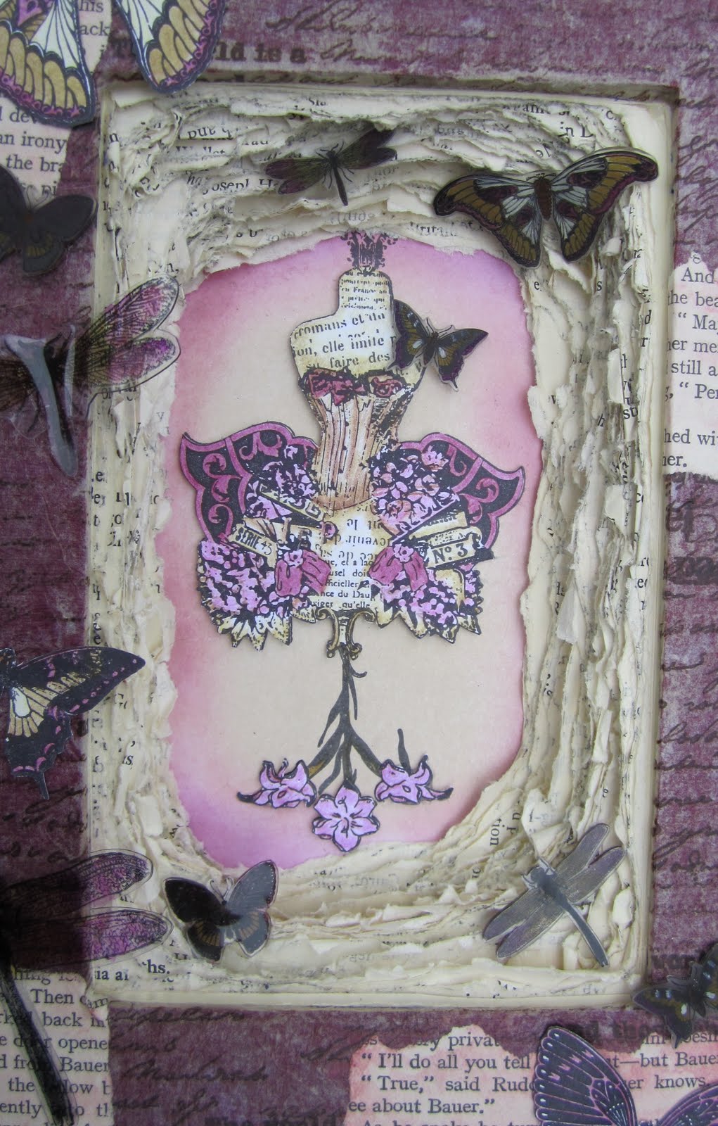
I knew as soon as I saw my project, that I would like to make this one, even before I had the chance to choose the CSQ project. I have chosen, funnily enough, another Rachel Jackson project; it is on page 8 of the April Craft Stamper magazine 'Carve a Niche'. I love old books, I regularly go to charity shops and buy them to alter, or use the pages in mixed media projects. I look for lovely covers, and have some really textured ones waiting to be made into something new. For this project, I found a great burgundy book, which was a good size, big enough for my main stamp, with plenty of space around the edges, as I had plans to add embellishments.
I used a lovely stamp by Stampington and Company as my main image, colouring it with my Polychromos pencils in the chosen colour palette. I decoupaged it onto a piece of card that I had coloured with chalk inks.

I followed Rachel's instructions to cut the front of my book out, and tear through my book pages, as you can see, it took ages! I decided not to paint my pages though, as I wanted a creamy feel to my pages.
I then took some tissue paper, and stained it with tea, and left it to dry. I stamped this with a script stamp from IndigoBlu, and a phrase from The Artistic Stamper, in Timber Brown Stazon. I added this to my book cover with matte medium, as I wanted the burgundy colour to show through, in keeping with the colour palette. I added pieces of book page randomly, painted with a very diluted wash of Cranberry paint dabber.
I then stamped lots of butterflies, some onto card, some onto shrink plastic, and some onto Clearly for Art. I coloured them in, either using my Polychromos, or alcohol inks, shrinking, or heating them where necessary.I then stuck them to my book.


I then added a ribbon inside the book covers so that I could tie the book closed, as per Rachel's instructions.

I had an onlooker when I was taking my photos, the eagle eyed amongst you will spot her paw in this photo, she wouldn't budge as she likes to be involved. Finally, here is the finished article:

I thoroughly enjoyed making this project, and would certainly make another one. I have Rachel to thank both for her colour inspiration, and the tips and hints on the book project.
Thanks for stopping by today, Judith xx
Sunday, 24 July 2011
A quick peek (posted by Judith)
Hi folks, it's been a couple of weeks since Lesley's gorgeous project was posted on our Blog, and my own project is virtually finished now. Just a little bit more work, and I'l be done. I thought I show you a few pictures, and see if you could guess which project I've chosen to combine my colour palette with. My project has been chosen from either the March, April or May edition of the Craft Stamper magazine, which narrows it down slightly for you.

I am sticking to the colour scheme of cream, latte and bordeaux, as you can see by the photo above. But that probably doesn't help you too much does it?

It is a lovely project, which I liked the look of as soon as I saw it, and wanted to make it straight away. So being able to combine two challenges was perfect for me. Need some more clues?

I'm using some of my favourite imagery, butterflies of course, but that isn't really a clue in this case, sorry! There are some real clues in the pictures though, so have a think, and here is one last sneeky picture.

Thanks for stopping by today, Judith xx

I am sticking to the colour scheme of cream, latte and bordeaux, as you can see by the photo above. But that probably doesn't help you too much does it?

It is a lovely project, which I liked the look of as soon as I saw it, and wanted to make it straight away. So being able to combine two challenges was perfect for me. Need some more clues?

I'm using some of my favourite imagery, butterflies of course, but that isn't really a clue in this case, sorry! There are some real clues in the pictures though, so have a think, and here is one last sneeky picture.
Thanks for stopping by today, Judith xx
Wednesday, 6 July 2011
On The Cover ................ not quite!
Hello Everyone,
I hope this evening finds you refreshed by the recent rain but not downhearted by it. Personally, I am so relieved it has cooled down although my craftroom/conservatory has still been unbearably hot. Oooh, I'm such a spoil sport when it's hot!
Well, tonight it's my turn to post my project for this month and as Sue correctly guessed from my earlier teaser I chose Hels Sheridan's 'On The Cover' project from the April 2011 issue of Craft Stamper for my inspiration together with the lovely colour palette Judith chose for us to use from Rachel Jackson's Designer Palette in the May 2011 issue. I didn't adhere strictly to Hels' wall hanging because I didn't use the Craft Stamper free cover mount stamps but instead spent ages going through my stamp collection to find the ones I wanted to use. I did use one of the cover mount stamps but the rest were a mix from Chocolate Baroque, Paper Artsy,Creative Expressions and Inkadinkado for the main Stampbord images, Stampers Anonymous for the background script and finally a new company called IndigoBlu for the crackle background on the canvas.

The first problem I encountered was finding suitable ink colours in my quite substantial collection. I actually had both the Umber and Burgundy inks but one was a cube and the other a cat's eye and both were so old they were too dry to use so I had to look for alternatives. I finally settled on Coffee Archival, Parchment Paris Trunk and Aged Mahogany, Vintage Photo and Walnut Stain Distress Inks.

I love working with Stampbord so inking and stamping the tiles before covering them in UTEE was a real pleasure to do. I do have a question for any Stampbord experts though. I really enjoy doing the highlights with a scratch tool but even though I usually give the piece a blast of the heatgun to make sure the ink is thoroughly dry, as soon as I cover it with UTEE the highlights just about disappear and it really annoys me. If anyone has a tip on how to stop this happening I would be grateful to hear it. I actually forgot to sand the edges of my tiles before embossing them, lol!

To colour the middle of my canvas I found it was taking far too long (and too much ink from my precious pad) using the Parchment Paris Trunk so I mixed a very pale creamy colour from some acrylic paints and covered my canvas with that before inking round the edges with Vintage Photo and Walnut Stain. I used a babywipe to take some of the ink from round the edges as I wanted it to look patchy. I did this instead of the UTEE that Hels added to her canvas edges and also stamped the fine crackle (I stamped off onto scrap first so that the ink wasn't too dark).

I used a Chocolate Baroque flower stamp in two sizes to make my Grungepaper flowers and then filled the middles with Glossy Accents before adding some tiny gold beads. I had the perfect beaded fringing in my stash plus the gorgeous steampunk butterfly and a lovely crystal type drop and finally some Ideology bits. The other mistake I made (hmmm, they say confession is good for the soul, lol) was forgetting to punch the holes in my canvas board BEFORE I stuck the tiles on. I had a heck of a job getting the Crop-a-dile at an angle that wouldn't damage the tiles when I squeezed to punch the holes.

Well, that's my offering for this month. I thoroughly enjoyed making this so thanks to Rachel for the lovely colour combo (even though mine is not quite the same) and Hels for the project inspiration. As always thankyou for visiting and for any comments you have time to leave. I don't think it will be long before the next one of my buddies is ready with her project so keep an eye out for the post.
Hugs
Lesley Xx
PS After publishing the post I noticed that the pics are a tad blurry but if you click on them the zoomed images are fine. Xx
I hope this evening finds you refreshed by the recent rain but not downhearted by it. Personally, I am so relieved it has cooled down although my craftroom/conservatory has still been unbearably hot. Oooh, I'm such a spoil sport when it's hot!
Well, tonight it's my turn to post my project for this month and as Sue correctly guessed from my earlier teaser I chose Hels Sheridan's 'On The Cover' project from the April 2011 issue of Craft Stamper for my inspiration together with the lovely colour palette Judith chose for us to use from Rachel Jackson's Designer Palette in the May 2011 issue. I didn't adhere strictly to Hels' wall hanging because I didn't use the Craft Stamper free cover mount stamps but instead spent ages going through my stamp collection to find the ones I wanted to use. I did use one of the cover mount stamps but the rest were a mix from Chocolate Baroque, Paper Artsy,Creative Expressions and Inkadinkado for the main Stampbord images, Stampers Anonymous for the background script and finally a new company called IndigoBlu for the crackle background on the canvas.

The first problem I encountered was finding suitable ink colours in my quite substantial collection. I actually had both the Umber and Burgundy inks but one was a cube and the other a cat's eye and both were so old they were too dry to use so I had to look for alternatives. I finally settled on Coffee Archival, Parchment Paris Trunk and Aged Mahogany, Vintage Photo and Walnut Stain Distress Inks.


I used a Chocolate Baroque flower stamp in two sizes to make my Grungepaper flowers and then filled the middles with Glossy Accents before adding some tiny gold beads. I had the perfect beaded fringing in my stash plus the gorgeous steampunk butterfly and a lovely crystal type drop and finally some Ideology bits. The other mistake I made (hmmm, they say confession is good for the soul, lol) was forgetting to punch the holes in my canvas board BEFORE I stuck the tiles on. I had a heck of a job getting the Crop-a-dile at an angle that wouldn't damage the tiles when I squeezed to punch the holes.

Well, that's my offering for this month. I thoroughly enjoyed making this so thanks to Rachel for the lovely colour combo (even though mine is not quite the same) and Hels for the project inspiration. As always thankyou for visiting and for any comments you have time to leave. I don't think it will be long before the next one of my buddies is ready with her project so keep an eye out for the post.
Hugs
Lesley Xx
PS After publishing the post I noticed that the pics are a tad blurry but if you click on them the zoomed images are fine. Xx
Saturday, 2 July 2011
Wish You Were Here

I thought Judith made a very clever choice when she settled on Rachel Jackson's Designer's Palette project from May's Craft Stamper. We'd all been so busy it seemed sensible to choose a project that could be completed quite quickly if we chose. But I found myself quite tested by it. For starters I realised that my colour vision is quite unreliable and when I saw the article the latte colour seemed quite green to me. Not a good start. I searched my inks and found the bordeaux colour hard to match up. The closest I could come was Cranberry which semed far too red. But I had brand new Indigo Blu stamps I was itching to try so I jumped in with both feet and liked the way the cranberry went with the latte and cream. I always intended to get myself an ink which better matched the ones Rachel had used in the article but before I knew it my project was at the point of no return!
In April's Craft Stamper I had been very taken with Jo Firth-Young's shaped concertina book and made a mental note to try something similar with my Baroque Bigz die. After playing with the Indigo Blu Grand Tour stamps I decided I would make a travel themed book and as my first attempts had looked good in the latte and cranberry, I decided to go with that.
As I was making my pages I was still in three minds as to how I was going to put my book together. Only at the last minute did I decide to make acetate hinges. They worked well for most pages but looked a bit clumsy on the burgundy backgrounds and, needless to say, if I was making this again I might do things a little differently.

The book takes its title from my favourite stamp from Indigo Blu's Grand Tour I set of stamps. It is called Wish You Were Here and you will see it on a later page. The bicycle stamp is from the same set. The background is made with the map stamp from Grand Tour II. I love the stamp and can see I will be using it a lot. You can't tell here but the map is of a favourite place of mine - the Lake District near Coniston and Windermere. I printed the title plaque on my printer and used an Elusive Images Creative Acrylic piece over the top.

The left hand page here uses a variety of stamps. Boys on Bikes is an Elusive Images stamp. The bus ticket is from The Open Road by The Artistic Stamper. The striped background is Holiday Stripes by Hero Arts. The top half of the page is made by inking through punchinella and stamping with the postmark stamp from Paperartsy Man of Numbers Plate 2. The right hand page was made with the Starry Night and Woodgrain embossing folders by Craft Concepts. The flags are made from newspaper and remind me of the ribbons we used to win on sports day at school.

Judith very kindly shared with us some lovely wooden Scrabble tiles which I used here with the Indigo Blu map stamp again and the compass from CI-294 by Crafty Individuals. On the right hand page I have used a Crafty Individuals' crackle stamp and the Artistic Stamper bus tickets from The Open Road. The arrows are Grungeboard Mixed Minis.

The gears page uses stamps from Crafty Individuals CI-294 again. There are also watch parts from The Artistic Stamper and some Tim Holtz Idea-ology sprockets. The card cogs were made with Sprightly Sprockets Nestabilities. Cycling Knickers is from The Open Road and the background is made with stamps from the same Crafty Individuals elements set and Sun Rays embossing folder. I added a swivel clasp for a bit of extra movement on the page.

This is the aforementioned Wish You Were Here stamp. I stamped it over a background made by inking through a compass mask by That Special Touch and layered up the lady on the top. The crackle stamp is there again in the background along with the wheel from The Open Road.

This page features stamps already mentioned. I've used a tiny Tim Holtz file folder and made the page a little bit interactive...


Here I've used one of the Mixed Minis again with a number stamp taken from one of the bus tickets. I think this was probably my favourite page.

I needed to keep the back page fairly flat but couldn't resist layering up the scroll, which is from Elusive Images' Harlequin Mask. The wheel is from The Open Road and the text from Indigo Blu Grand Tour II. In the background the page is embossed with Starry Night again and I have picked out the texture with a gold rub-on.
This wasn't the quick and simple project I'd thought I would be making but I loved doing it and in spite of the time it took I never tired of looking at the stamps or enjoying the colour combination. I wouldn't have used these colours without Rachel's inspiration but I like them so much now that I know I'll be turning to them again.
Monday, 27 June 2011
And the Winner is ...............................
Well, I obviously made that much too easy didn't I, lol! Thanks to Sue, Aquarius and Veronica for having guessed correctly. Sue, of course was the first to guess within minutes of my posting really but I didn't get chance to publish the comment until this evening. So can you email me your snail mail addy please Sue. I'm sure I have it somewhere but for the life of me can't find it and this is Sue's blog, http://suzib1b.blogspot.com/ which is well worth a visit. She has some lovely artwork on there and I visit often.
Thanks for having a guess ladies and look out towards the end of the week as Jo finished her project first so just needs a bit of time to be able to do the post and I will follow soon after with mine which I finished on Saturday.
Well I hope you haven't melted today. I don't think I've ever drunk so much water (which I hate) to stave of dehydration. 'Normal' temperatures on the way for Wednesday though thank goodness, lol!
See you in about a week's time all.
Hugs
Lesley Xx
A Little Poser For You ...............and a friendly competition. (posted by Lesley)
Happy Monday Morning Everyone,
I sincerely hope the temperature is not too much for you this morning. I have had the fans going from first thing this morning and to be honest, I could have done with keeping one on all night. Phew, it's blooming hot around here and I'm not a happy bunny in the heat, lol!
Anyway, enough of my English obsession with our weather, as the title says I have a little poser for you. If you remember when Judith announced our project for this month she had chosen a colour combo for us from the talented Rachel Jackson's article on page 76 of the May issue of Craft Stamper. Judith gave us licence to choose our own project to use this combo on so I decided to work backwards through my CS mags until I found one I thought would fit the bill.
Now, when I was looking through my many stamp sets trying to decide which I was going to use on my project I realised that I had doubled up on a little set of Paper Artsy stamps so I decided to have a little friendly competition. I want to stress that you do not have to be or become a follower of our blog to enter. All you have to do is have a guess at which project I have chosen from looking at the pic below and leave your answer in a comment. The first person to guess correctly will win the set of stamps (and I might find a few other bits and pieces to put in the envelope too). As a clue so that you don't go trawling through tons of past issues I will tell you that the project is in a Craft Stamper issue from either February, March or April this year.
This is the useful little set of stamps.

and this is a peek at some of the stash I used to make my project.
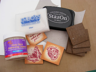
Even my buddies don't know which project I've chosen but they're not eligible, lol! I hope someone guesses correctly.
Have a good Monday everyone and as always thanks for your lovely comments.
Hugs
Lesley Xx
Friday, 3 June 2011
Have Book Will Travel (posted by Judith)
Oh dear, the time just flies, I'm last to post as per usual, I'm afraid. I have had a very hectic few weeks, and had almost made up my mind not to take part in this particular challenge. However, a trip to the Happy Stampers Show a couple of weeks ago changed my mind, as I bought some fabulous stamps, that enabled me to finish this project in just the way that I wanted to.
My poor Husband broke his collarbone recently; he has to take things easy and be careful. I decided to make a Father's Day gift for him with this project. Because of the book-like nature of the card, I decided very early on to use the Tim Holtz bookplate stamps. It's not going to be very often that I can use these, and this seemed like an ideal opportunity. I chose a theme of olive green, blue and brown for the project.
 The front cover sets the colour theme straight away. I have added a fabulous steampunk style butterfly from a relatively new company called Indigo Blu, their stamps are just so useful, and I really like them.
For the inside covers, I wanted my book to have the feel of lined Italian papers, I bought the perfect stamp at HSNW from a company called Stamp Camp. I coloured some white card with my Distress Inks, then brayered the stamp with Versafine Ink. These were the inside covers before I had added anything else;
 I had to stamp an extra piece on the bottom, but most of that would be hidden once the project was finished.
My box section used the smaller bookplate stamp for the front, in an olive green colour this time. I had to trim the stamped images each time I used them, but only slightly, they worked out realyy well for this project. For the sides of the box, and the spine of the book, I chose to use Tim Holtz tissue tape, and coloured it with Distress Ink. It was just the right thickness.

I used a bookplate shaped Nestability to cut the window in my box, keeping in with the book theme. I had planned to put a large bag of Galaxy Minstrels in the box for my OH, but the bag is way too big, even folded over or scrunched up! I will just put a plastic bag inside the box, and tip as many as I can in there. I have already added an acetate window to the box, but I don't want melted chocolate inside the box!
I added a pocket to the left side of the inside, using Kraft card, second stamping a lovely crackle stamp from Indigo Blu. I have added more Indigo Blu stamped pieces, and an Ideology tag to the pocket, which I have painted with Guacamole Fresco Finish paint, and then rubbed off the excess. The green paint then just goes into the lettering.

I made a tag to go inside the pocket, using another Indigo Blu stamp with Italian script and a beautiful building. I stamped this onto Kraft card, after colouring the card slightly with Distress Inks. I added a bit more of the crackle stamp, and some tissue tape.

I am also adding a book token from a certain bookstore so that my OH can go and buy himself a book or two and maybe relax a bit. He has come to enjoy reading in the last couple of years. He needs to slow down, and how better than with a good book?
 My final picture shows the back cover, where I have used the bigger bookplate stamp again, the bookplate Nesties, and a great stamp from The Artistic Stamper. (The 'Travel' stamp on the front is from the same set).
 So there you have it, fingers crossed that he likes it! He doesn't generally check this blog out, so I don't think that he will spot his gift, as long as I hide the actual card well at home. Thanks to Debbie Dolphin for such a great project, and to Jo, for choosing it for us.
Now, onto our next project!!! I chose this project a few weeks ago, so we have been thinking about it for a little while. I was very conscious that we were falling behind in our magazines again, so I skipped up to the May edition of Craft Stamper, but gave the girls a bit of a twist. I chose Rachel Jackson's Designer Palette on page 78. The colours are Cream, Latte and Bordeaux. However, I told the girls that I was dipping back in time to make a project in one of the magazines that we had skipped, using those colours but I wasn't going to tell them which project in advance. They were welcome to do the same. It would be amazing if any of us picked the same project, wouldn't it?
I know that one or two of the girls are definitely planning to show you sneak peeks this month, remember those? We used to do those when we weren't so busy, those were the days. Anyway, look out for some crafty snippets coming your way. Thank you for sticking to the end, if you are still reading this, Judith xx
My poor Husband broke his collarbone recently; he has to take things easy and be careful. I decided to make a Father's Day gift for him with this project. Because of the book-like nature of the card, I decided very early on to use the Tim Holtz bookplate stamps. It's not going to be very often that I can use these, and this seemed like an ideal opportunity. I chose a theme of olive green, blue and brown for the project.

For the inside covers, I wanted my book to have the feel of lined Italian papers, I bought the perfect stamp at HSNW from a company called Stamp Camp. I coloured some white card with my Distress Inks, then brayered the stamp with Versafine Ink. These were the inside covers before I had added anything else;

My box section used the smaller bookplate stamp for the front, in an olive green colour this time. I had to trim the stamped images each time I used them, but only slightly, they worked out realyy well for this project. For the sides of the box, and the spine of the book, I chose to use Tim Holtz tissue tape, and coloured it with Distress Ink. It was just the right thickness.

I used a bookplate shaped Nestability to cut the window in my box, keeping in with the book theme. I had planned to put a large bag of Galaxy Minstrels in the box for my OH, but the bag is way too big, even folded over or scrunched up! I will just put a plastic bag inside the box, and tip as many as I can in there. I have already added an acetate window to the box, but I don't want melted chocolate inside the box!
I added a pocket to the left side of the inside, using Kraft card, second stamping a lovely crackle stamp from Indigo Blu. I have added more Indigo Blu stamped pieces, and an Ideology tag to the pocket, which I have painted with Guacamole Fresco Finish paint, and then rubbed off the excess. The green paint then just goes into the lettering.


I am also adding a book token from a certain bookstore so that my OH can go and buy himself a book or two and maybe relax a bit. He has come to enjoy reading in the last couple of years. He needs to slow down, and how better than with a good book?


Now, onto our next project!!! I chose this project a few weeks ago, so we have been thinking about it for a little while. I was very conscious that we were falling behind in our magazines again, so I skipped up to the May edition of Craft Stamper, but gave the girls a bit of a twist. I chose Rachel Jackson's Designer Palette on page 78. The colours are Cream, Latte and Bordeaux. However, I told the girls that I was dipping back in time to make a project in one of the magazines that we had skipped, using those colours but I wasn't going to tell them which project in advance. They were welcome to do the same. It would be amazing if any of us picked the same project, wouldn't it?
I know that one or two of the girls are definitely planning to show you sneak peeks this month, remember those? We used to do those when we weren't so busy, those were the days. Anyway, look out for some crafty snippets coming your way. Thank you for sticking to the end, if you are still reading this, Judith xx
Thursday, 19 May 2011
There's no Present like the Time (posted by Jo) and, yes, you did read that right!

I was excited to have Debbie's great project to work with this month as we have come very close to choosing her projects before. She is a designer we all admire. But strangely, the things I loved most about her box card were things I didn't carry through when I made my own. I intended to go with Debbie's colours and to choose a similar stamp as I love anything with even a hint of ironwork. But things changed along the way as they often do. I was going to go with architectural stamps and make something for my son who is a student architect. But I eventually settled on a time theme. I made a masterboard using stamps by Paperartsy and The Artistic Stamper. I embossed in gold and inked the background with Tumbled Glass and Vintage Photos Distress Inks (I've always admired people who can pull off the blue/brown combination). I used the resulting papers more sparingly than Debbie did with hers as I thought it would look cluttered with all sides of the box covered. On the front page I mounted a strip of the paper onto a piece of watercolour paper edged with Vintage Photo and gold embossing and matted this on brown card. I wanted a cluster of chipboard flowers but was surprised at how small the card was when I made it up to Debbie's dimensions so I settled for just the one flower with a clockface centre. I stuck this over my favourite flourish from the Inkadinkado Dotty Flourishes set and completed the page with the time adage from The Artistic Stamper's Time and Keys plate.

Inside the card I used another strip of the masterboard mounted onto another piece of watercolour paper. This time the paper had been embossed with Creative Expressions' Time embossing folder and inked, again with Vintage Photo. Over the panel I added a clock charm using a chain and swivel clasp.

One inspiration for the contents of the box was the Sizzix label die that is shaped like a watch. But the die turned out to be slightly too big for the box front so I had to improvise. The watch inside the box is rather special. It belonged to my late father in law and is a treasured possession of my husband's. So the box is a display box for now but will maybe become a gift box when my son inherits the watch.

We didn't see the back of Debbie's card in Craft Stamper but I couldn't resist using Crafty Individuals' lovely watch and clockmaker label on the back. On the watercolour background I have used clock stamps from The Artistic Stamper and also the free clock stamp from February's Craft Stamper which features Debbie's project.

Looking at Lesley's and Elaine's posts I am struck by how differently we work with the magazine projects we take as our inspiration. It's especially surprising as we have quite similar tastes. I sometimes wonder if I would do things differently if I saw their projects first as I am very easily influenced. But then this one has turned out very different from the one I had in my head when I started so it's all a bit of a mystery ride.
Sunday, 8 May 2011
The Secret Garden (posted by Elaine)
It's my turn to post our next project which is actually from as far back as the February issue of Craft Stamper. Life has been so busy for us all one way and another. This is my take on Debbie Dolphin's card gift box project chosen by Jo. I decided to make mine as a birthday card for my CSQ buddy Lesley.


I edged the photo with lots of little leaves cut out of scraps of the 7 Gypsies papers with one of my favourite little Woodware punches, edging each one with a little more DI.


I am afraid I stayed in my comfort zone again with this project, a vintage nature theme! My main colour scheme was green as that is Lesley's favourite colour. I wanted to make my cover look like a vintage book and used a combination of stamps and pieced together different pieces of embossed card to do it, using a ton of extra strong DST!
I used a large fern background stamp I bought from Rubbernecker at Ally Pally for the main panels, embossed in two colours of my favourite Moonglow Obsidian powders and cut in half. I edged the panels with a border of an ancient letters border stamp from Third Coast. I love their border stamps - they are brilliant value for money too - available from Happy Daze! I added large square bronze brads like studs on the book cover.

For the book title I stamped some words from a much larger Secret Garden B Line stamp that I adore. For the spine I used another Third Coast border with the letters.

The inside uses papers from the lovely 7 Gypsies Conservatory collection, (just rights as Lesley crafts in her conservatory!) with some elements cut out in the pocket and an image stamped from a Crafty Individuals image stamped in Olympia Green Versafine and aged with Vintage Photo DI. I added a little cream guipre butterfly ribbon, again aged with a little VP DI. I decided to add a picture on the gift box section as I planned to put some ribbons and braid in there and I felt it might look a bit messy with all the different colours if I didn't cover it up. I used an image from a vintage postcard that I love.

I edged the photo with lots of little leaves cut out of scraps of the 7 Gypsies papers with one of my favourite little Woodware punches, edging each one with a little more DI.

Thank you Debbie for such great instructions and inspiration and thanks Jo for choosing the project!
Elaine
Subscribe to:
Posts (Atom)